

Black as death and kick-ass pink.
Jyoti Gondek reached out after she made the decision to run for mayor. A move that was well rumoured but not actually affirmed until Jyoti herself took the time to give it needed consideration.
Her previous campaign for the Ward 3 Council position back in 2017 was created by a different team. When she referred to it, I had to keep asking for a visual as I don’t really recall the design, and she was running in my own city ward!
This was then…

Her team’s mission was to create a colour palette that spoke to her centrist views and focus on the citizens living in the city. Essentially putting people first. Her extensive background and education in urban development is what was envisioned would set her apart from other candidates.
The Process
It all begins with research.
Following the political drama in the past four years, as a designer I have had my eye on the design of the various candidates. There were a few that really caught my attention, and then there were those that all seemed to meld into where you really couldn't see any differences between them.
I was excited about the Pete presidential campaign brand design. His team created a brand that was clean, consistent and had flexibility for each state in the country. Anyone could make the brand into a look and feel that represented their local community.
And then there is Alexandria Ocasio Cortez (AOC). The strong design and colour palette that showcased her vision as different from the establishment. Unique visuals that used a ‘protest’ visual language that spoke her message for positive change.
What is it about all of these political brands that didn’t sit right with me? The colour palettes are still all muted. Jyoti should not can honestly can not be muted. So when she spoke to her colour vision. I ran with it.

Choosing a colour palette.

The black I chose had some depth so has a mix of 100% black with more colour added to give it that ‘black as death’ feel. The choice of kick-ass pink, I started with a vibrant neon pink, but even though Jyoti wanted others to see her as scrappy, , but it was the deeper and reddish tinge of Pantone 206 that felt right. Strong but less outside the box.
In all of Jyoti’s messaging she emphasizes that in the spectrum she is a centrist and I wanted the colour to align with that. Bringing in the use of white cues in the transparency of her messaging. She isn’t going to be opaque, her message will be clear in black and white.
When it came to the pallet I couldn’t leave it to those only. The impact felt like it needed an extra kick. This is when looking at the rainbow, most of the colours out there that already align with a political brand, red = liberal, blue = conservative, orange = new democrats, green = environmental/green, and purple was claimed by another. So the spectrum left yellow.
I love how the yellow grabs attention, and that is where it will be used, on cover pages, social media posts and more. But when it comes to communicating policy, keeping it to black, white and some pink for emphasis, that is where the use of the colours will be.
What is in a name?
After speaking with Jyoti, I connected with her core team to get perspective. We agreed that when designing the brand, colour came first, and then creating a word mark to create name recognition.
There was not guarantee that the initial brand would be used in the longterm. So as long as we had these core decisions made - any tweaks made down the line would still ensure that the design had a consistent look and feel.
When I researched the use of names in campaigns, it seemed that women tended to go with last names. Perhaps to skim over the fact that they were women breaking into a world dominated by males and wanted to be taken seriously. Whereas men seemed to be comfortable being the boy next door capitalizing on their first name. Like Mayor Pete, or ‘feel the Bern’ of Bernie Sanders.
So yeah, it was time to flip that ideology the bird and focus on Jyoti’s first name. It’s easier to align with someone if you can be on a first name basis.
Choosing a font for this campaign it needed to be strong and clear, so a san serif choice of Proxima (and Roboto for the website) was a clear choice.
The lowercase i was an intentional choice. Jyoti’s centrist views allow her the space to be flexible, and an all caps word mark could be skewed as unmoving. I knew Jyoti to be approachable and I wanted her brand to reflect that.

All caps could lead to a feeling of stubbornness.

Allowing for a lowercase i gives a sense of flexibility and fun that align with Jyoti’s centrist views.
Then the theme…
In my meeting with Jyoti, she explained that the core message of her campaign vision was to create stability. With stability in place then the city would have a strong foundation to capitalize on opportunity which would open up into prosperity.
So while on a walk wandering the beautiful pathways of my community of Panorama Hills, I let my mind consider the visual icons of the word stability and strength.
So I considered construction and buildings. They were what would come to mind when thinking stability. And this is where at first I was thinking of the keystone of an arch. It is the centre principle of which all else depends. Sounded good, but Jyoti’s platform isn’t about putting her at the centre. Her vision is to create a team that may have different ideologies but a similar agreement on vision so they can debate with respect and civil discourse.

So this is when the idea of a ‘cornerstone’ came to mind. I loved the idea that it could frame up the word mark on it’s own and you’d get the sense of stability and framing the conversation. Making it pink represented the impact she wants to make.


Using icons to visualize an idea…
What I love about the start of this brand is how I can utilize the core elements and build them out into icons to be used to help visualize an idea or concept. Basically using the ‘cornerstone’ as the cornerstone of the creative as well.
Vote for JYOTi
Forward Direction
Balance
The Voice of the City
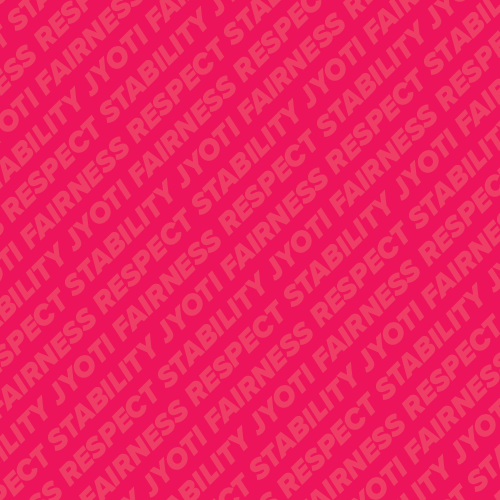
With so much to say…

For anyone who knows Jyoti or followed her 2017 campaign for Ward 3 councillor, been at the end of her extensive knowledge and decision making dialogue, knows that she has a lot to say and 140 characters is not the space to explain policy.
I created a brand element of a background pattern that could visually list out her priorities without deterring from the messages that do need to be clear.
Going forward, using this type of graphic element will help to design brochures, signage and other marketing materials to help the Calgary community to get to know Jyoti and understand her vision.
Leading to a brand that launches a candidate’s future…
This is now…


And here we have it. The brand combined the amazing photography by Honey Creative and the web design skills of Daryl at Sidepix, Jyoti was given the tools to be confident as she launched her campaign on January 13, 2021.